Print Design
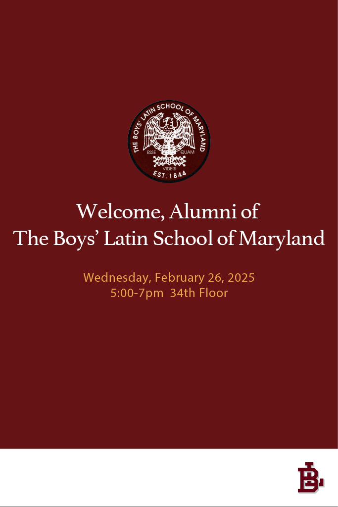
During my time as a desktop publisher, I was sometimes tasked with creating graphics for posters. Typically the posters were for an event or a promotion that was happening within the company. The posters above, for example, were made to be printed on a 24x36 foamboard. I'd print these designs from an HP designjet z1600, and adhese the prints to the board. My client was hosting an event for the Boy's Latin School of Maryland alumni mixer, and needed me to design something simple.
She sent me a few of the schools related logos, which I compiled into illustrator. The decision for the font (goudy) was to give it a sort of regal feel. That's why I also went with a dark-gold color, as I thought it complemented the red and white well. I wanted the insignia of the school to be the centerpiece, so I centered the text and placed it on top. The client was satisfied with the work.

This two page spread was designed in inDesign. I think my major challenge with this spread was just making sure the color of the body of text wouldnt be difficult to read. It intersects with a blue and red circle, so I opted to make the text white in those parts.
I really liked making that pull quote. My idea was opening the magazine and just seeing colors that were reminescent of the Sega Game Gear's logo colors. I needed it to feel vaguely retro without using cliche 8-bit fonts or pixels.