Versus Magazine
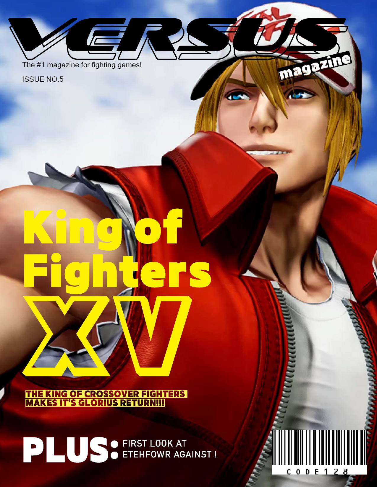
A fictional magazine I created for fun. Video games are kind of brash and visually loud, so I went for big fonts that were made to capture the attention of a passersby. In addition, I also wanted the cover model to have a huge presence on the cover. I used Illustrator to design the cover, which I thought was an efficient way in organizing the layers and art assets of the piece. I wanted the "VERSUS" logo to look like it was from the mid-2000's, with it's semi-futuristic design. As a little joke, that "Etehfowr Against" bit on the cover is just referring to a video game I made.
If you're wondering why I ended up using King Of Fighters as a topic for the cover story, it's because the game was relatively new and it was the only one I was thinking about at the time.

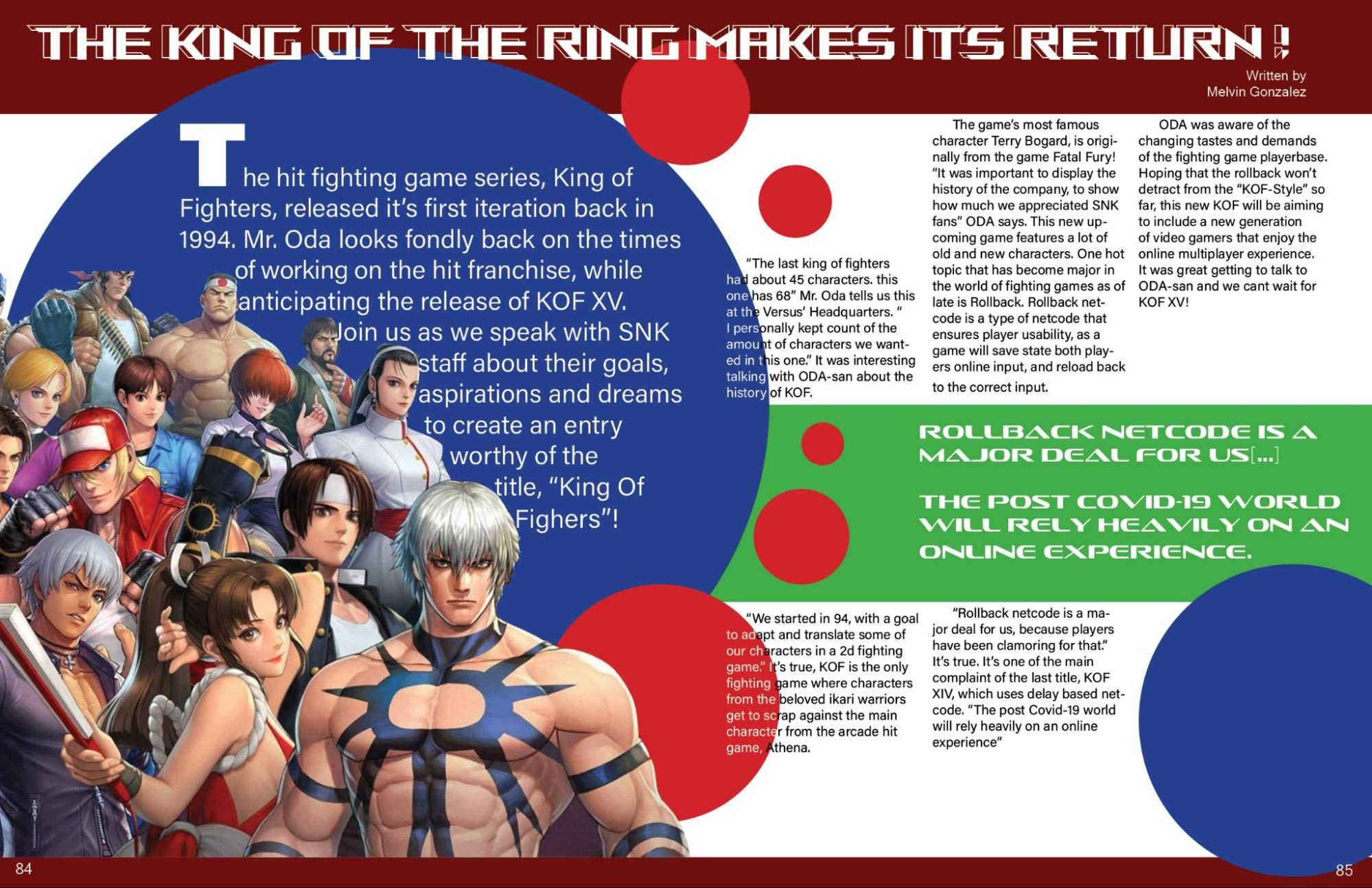
This two page spread was designed in inDesign. I think my major challenge with this spread was just making sure the color of the body of text wouldnt be difficult to read. It intersects with a blue and red circle, so I opted to make the text white in those parts.
I really liked making that pull quote. My idea was opening the magazine and just seeing colors that were reminescent of the Sega Game Gear's logo colors. I needed it to feel vaguely retro without using cliche 8-bit fonts or pixels.